Businesses struggle to achieve financial targets and performance goals due to mismanaged and misunderstood data, despite having access to Big Data through BI systems.
The restoration company needed more cohesive data visualization due to their 3-part problem
We built an immersive experience designed with the following:

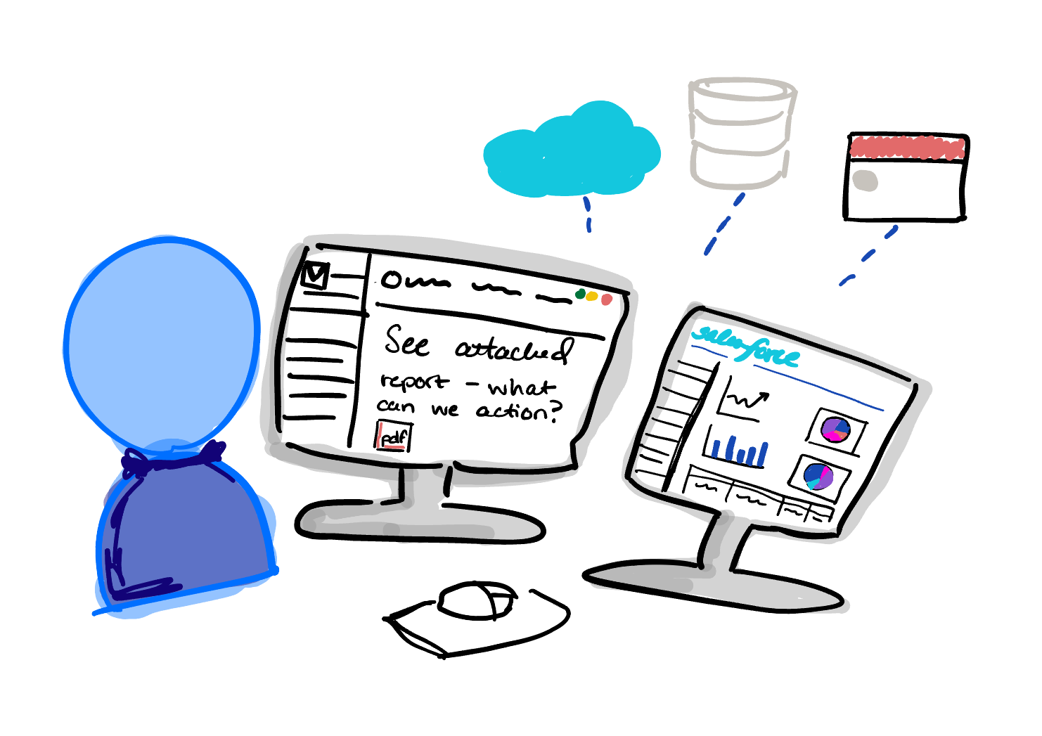
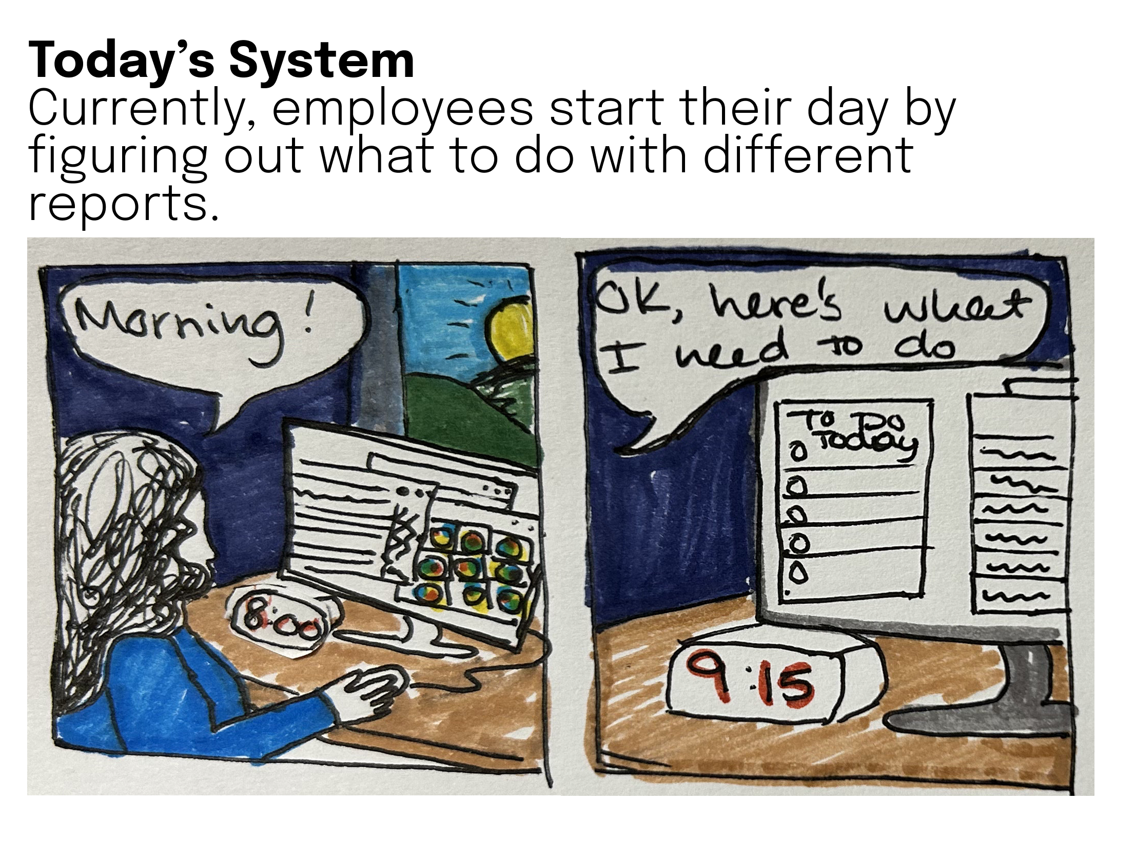
A restoration company was struggling with daily operational clarity due to disjointed, duplicated dashboards and unclear data sources. Reports were generated ad hoc, and employees had to sift through multiple data pipelines to determine what needed attention each day.
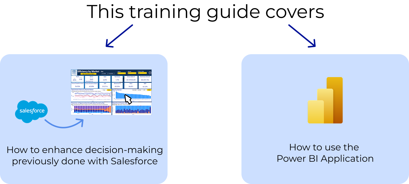
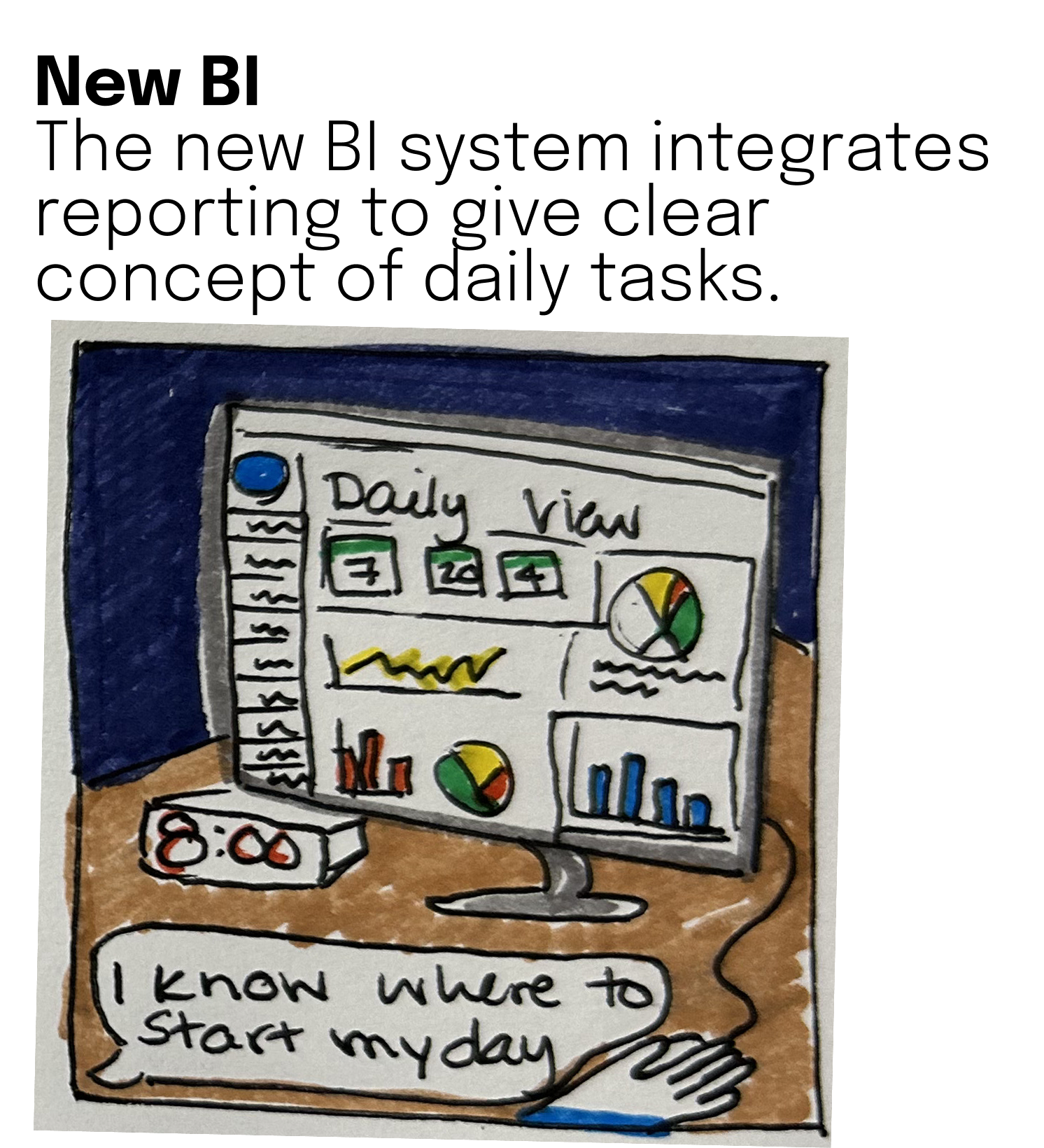
On top of this, the company was in the midst of a data platform migration and needed a more effective way to organize and understand its data. I then created a training visual to articulate this to the business.
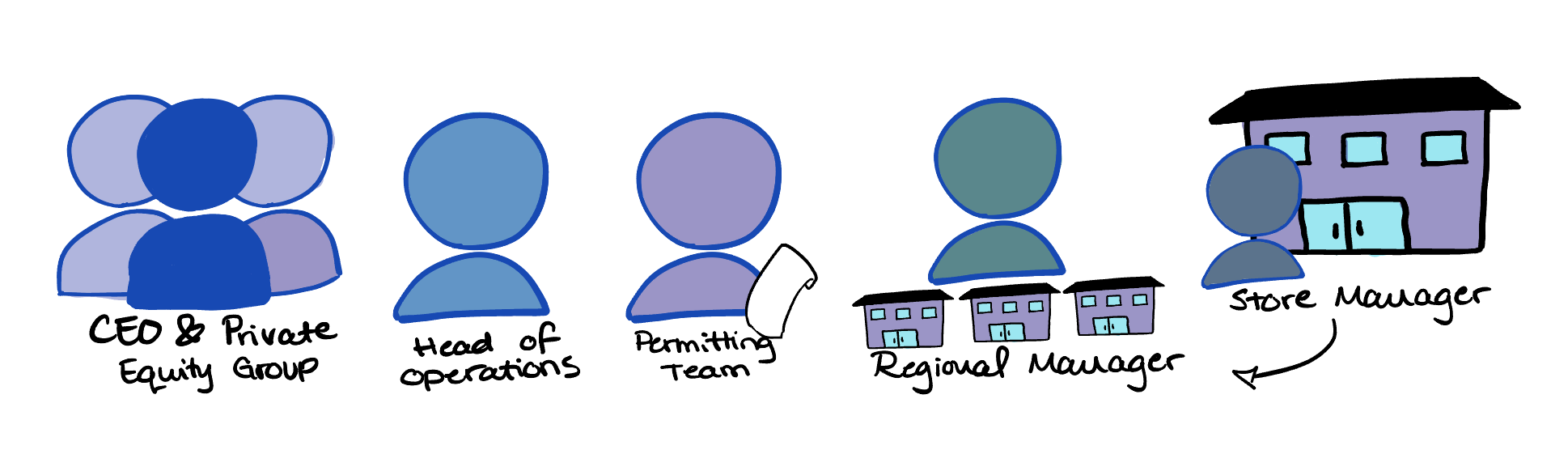
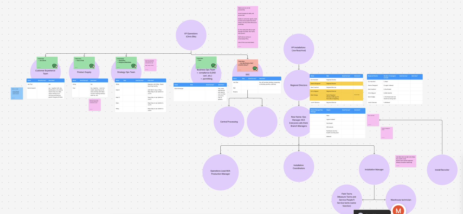
There were several core users that were needing to access the new dashboard.
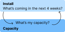
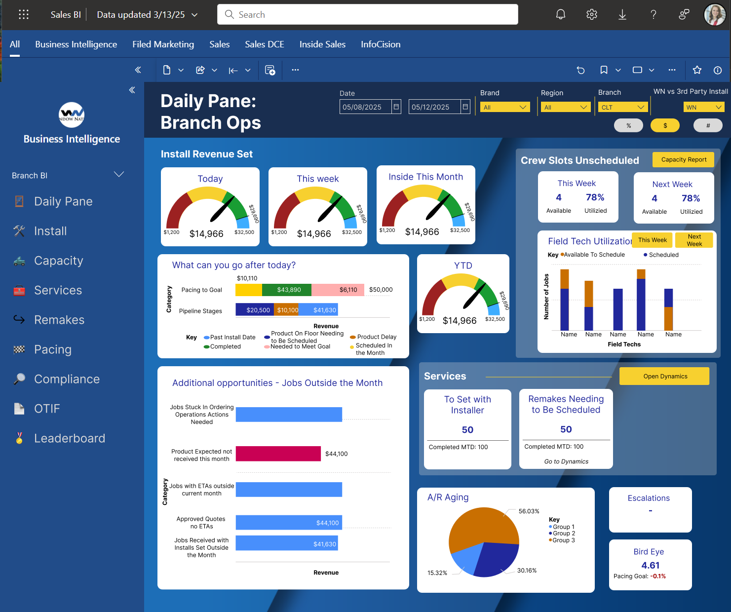
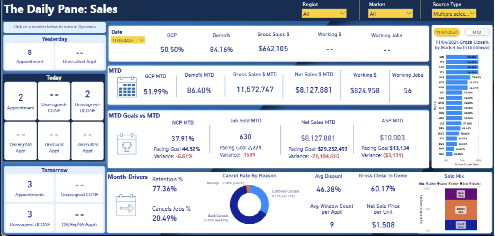
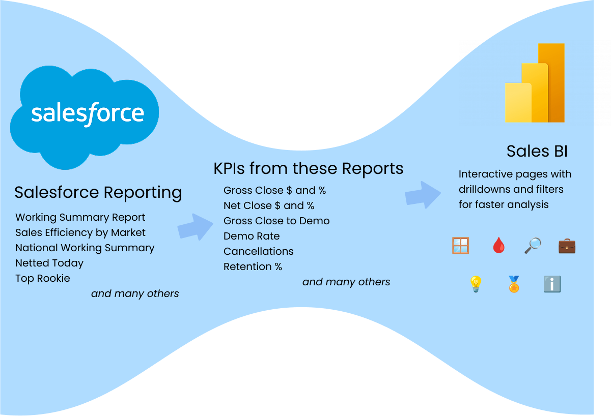
After mapping out user flows and analyzing over 60 daily dashboards and reports, I found that the overall message was to understand the relationship between install, what projects were scheduled, and capacity, what projects the team could actually complete.

My ideation process focused on exploring flexible approaches to data visualization and integration. Since this work is confidential, we were able to explore multiple idea spaces as concepts formed around how to migrate data into specific pipelines—ultimately enabling front-end manipulation for visualization.
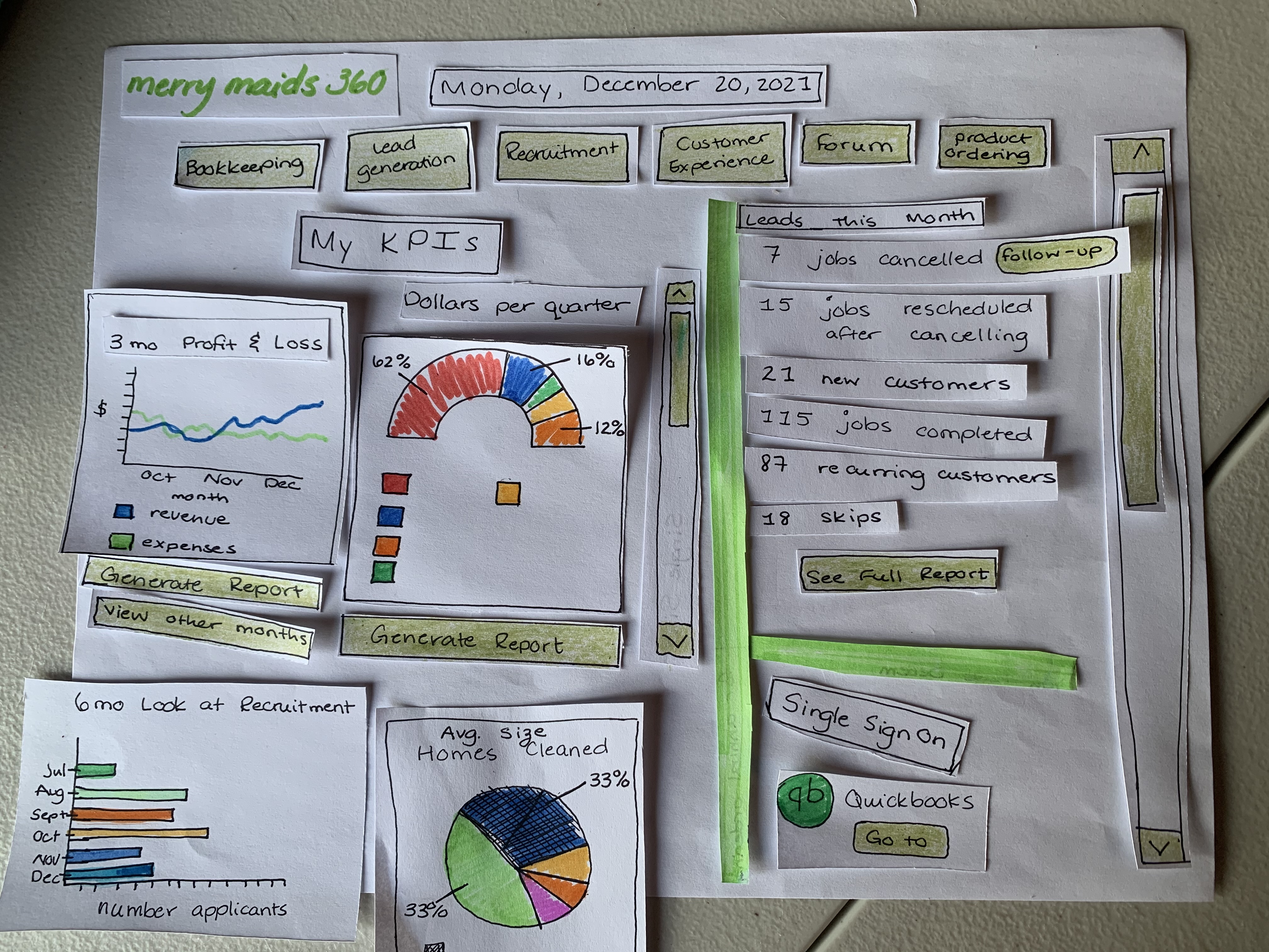
Using individual pieces, I thought through the layout and specific visuals needed. Using a paper prototype, I could easily create new ideas on the spot during ideation sessions and move them around the page as I collected feedback.
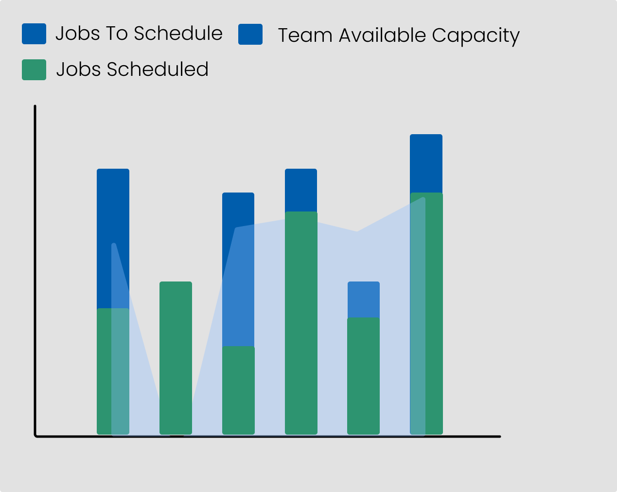
Using these ideas, I mocked up new visualizations that combined three related variables—scheduling set, bookings needed, and overall capacity—to reveal key insights.
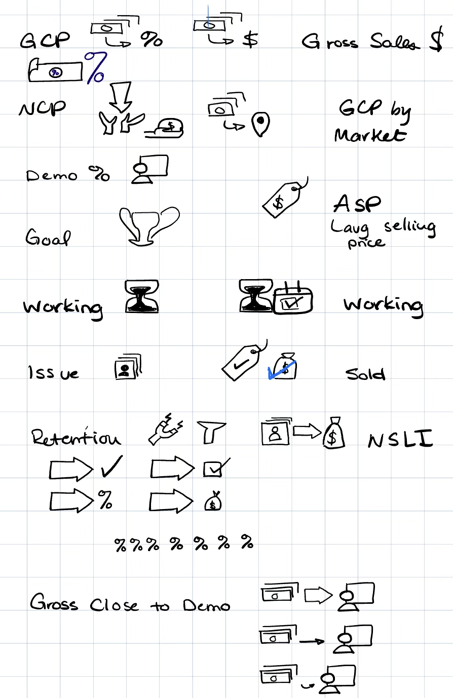
Sketching out different mockups, I explored what iconography would work best with the mental model of our users. This would become the icons used in the visuals, side tab names, and other places for faster recognition and uniformity through out the platform.

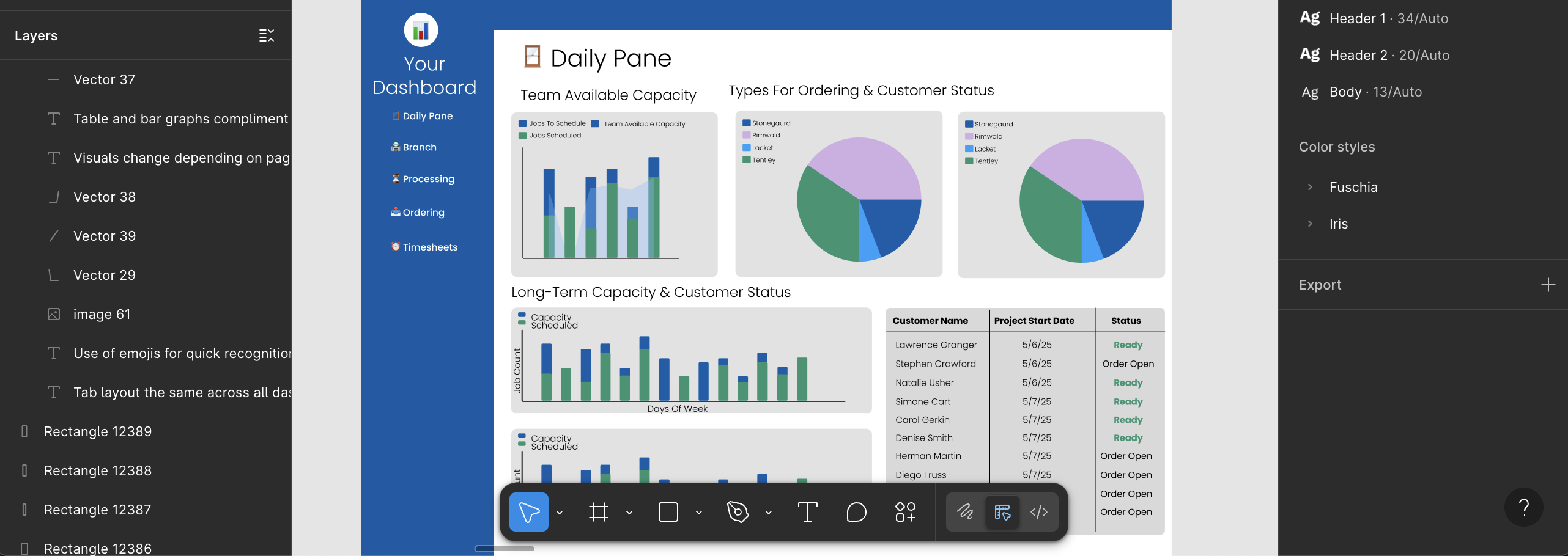
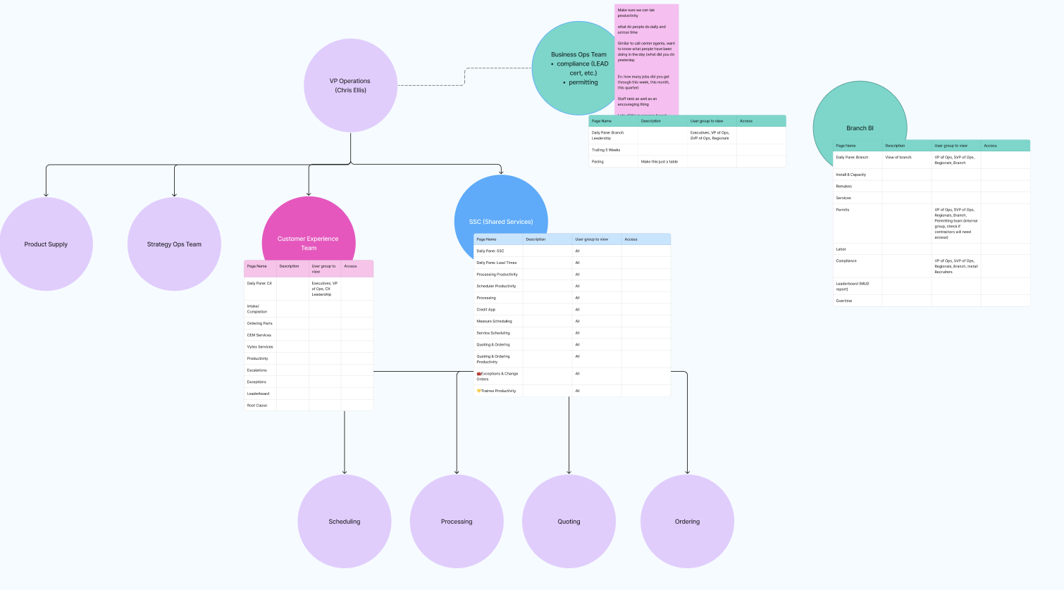
After solidifying our design ideas, I used Figma to prototype our initial concepts and organize what data sources we’d need, along with the backend development required to support the team’s front-end vision.


I also used the bento box method to group together areas on the dashboard according to their relevant and data refresh timing.
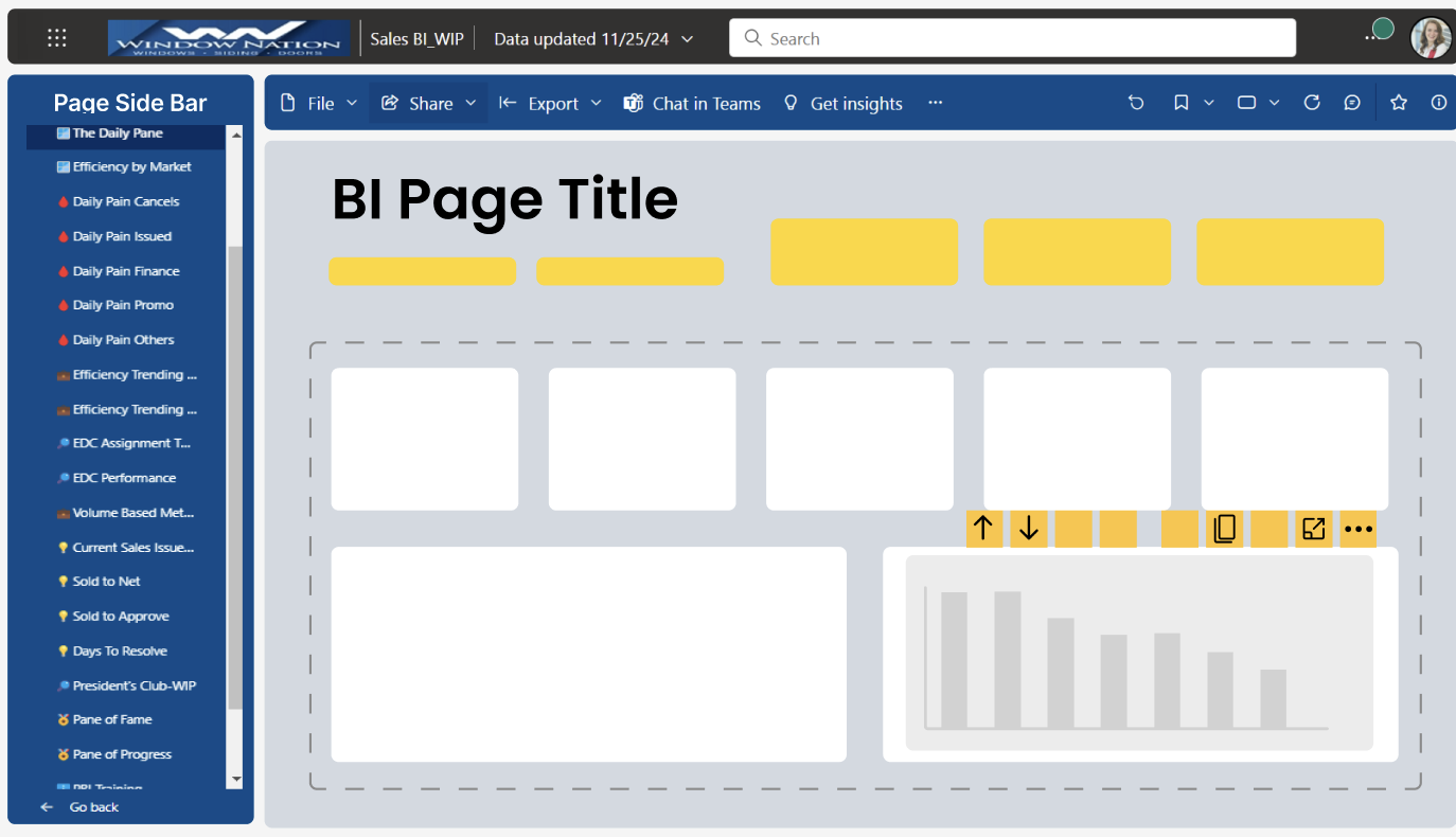
I also used emojis on the side tabs for faster recognition and because some tabs were getting cut off depending on window size. Each team had their own set of tabs replicating previous report names they were used to analyzing.